


The second thing I wanted to talk to you about (the first was brands of pencils - if you didn’t watch that one, I really recommend it!) is Value.
I am not talking about value as the amount to charge for a piece of art, nor the value of being a creative, which I think is immeasurable and invaluable, but rather, perhaps the single key element behind making art look realistic.
Colour itself is far less important than value.
Bold statement, but true.
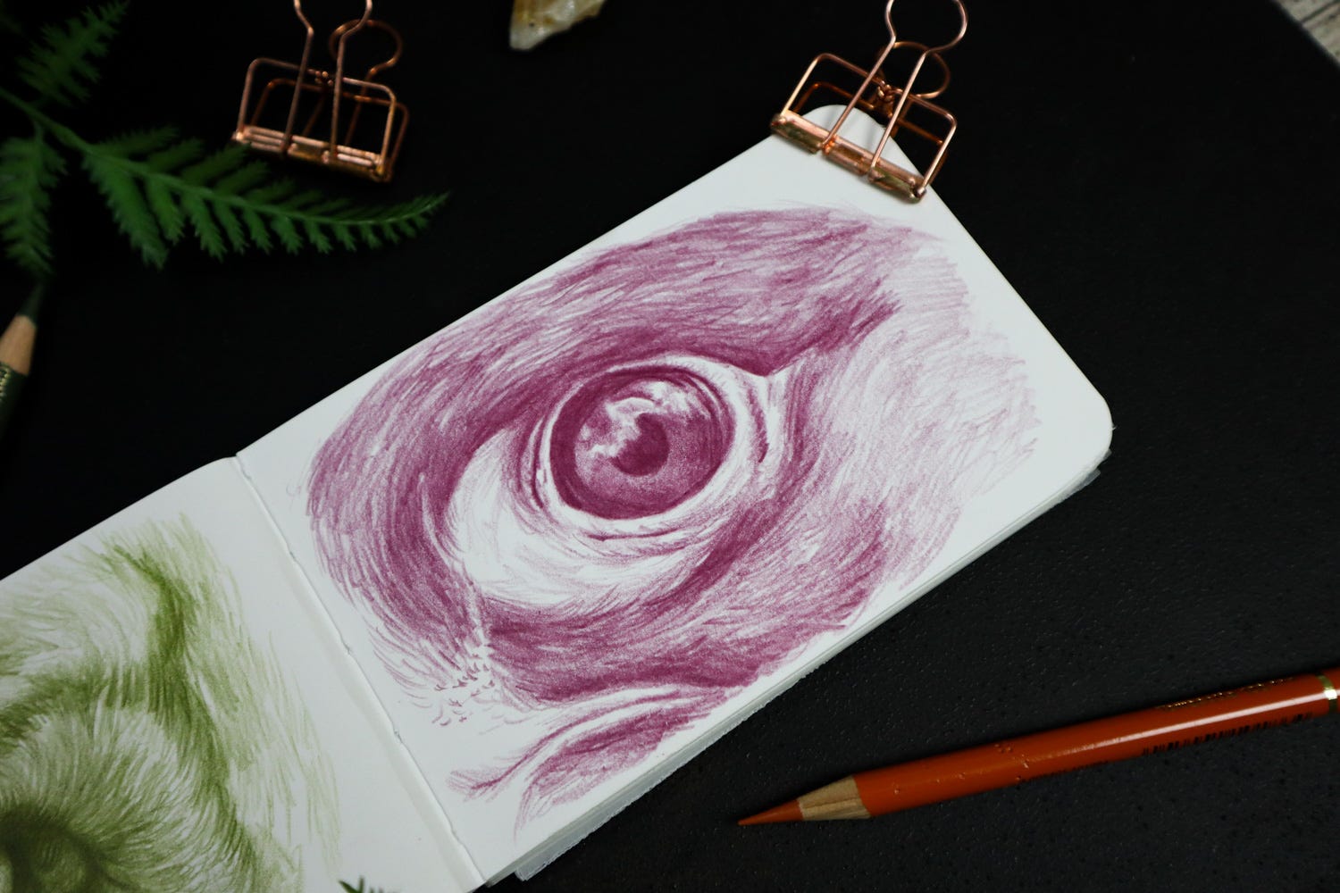
And perhaps one of the key reasons I absolutely LOVE sketching in a coloured pencil - something outrageous compared to the colouring of the wild being I am studying (Purple elk? Yes please. Orange rook? Absolutely!), because I can challenge myself to create something realistic that pays no mind at all to the colour. It is all down to value.
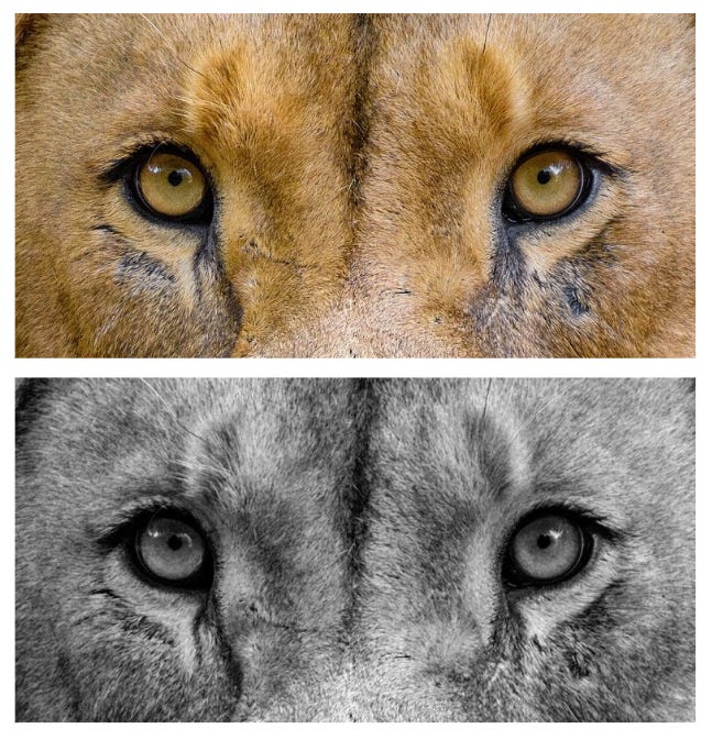
In the two reference images above you can see the value of value (see what I did there?).
In order to make a drawing appear three dimensional, we have to have a range of values. Value refers to darks and lights. It is the darks - the shadows - that help the light “pop”. Light areas come forward on the page, dark areas recede - that is how our eyes/brain perceive dimensionality, form in space, roundedness.
Generally speaking, if a drawing looks a bit flat to you, it is because there is not enough distance in value between the lightest light and the darkest dark.
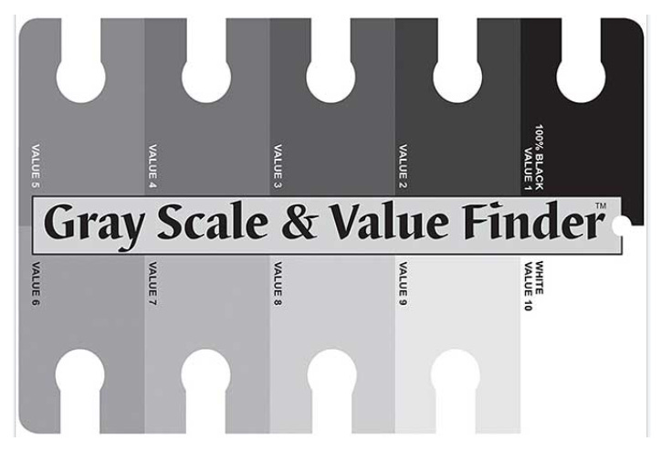
Below is a value scale to compare to the black and white image above.
Do you see how the really dark parts around the eye make the lighter (and shiny) eyeball come forward? And the brow comes towards you, while the area between the eye dips backwards, away from you?
Value studies are a really great way to understand what areas you need to make darker in order to give your drawing real life.
It does not have to be in black and shades of grey though - it can be in ANY colour (other than something too light). And I would go so far as to say that working in an odd colour for the reference has given me an even GREATER understanding of value, and it’s, well, value.
Not sure how to determine how your values are stacking up?
Turn your reference to black and white, then take a photo of your work and turn it to black and white as well, then compare. Where you see discrepancies in value is where you can keep going - and usually, that is adding more darks.
This was one of my biggest learnings when I was working only in graphite, and it is something I see students struggle with a lot - being sure to add enough oomph to your values, and particularly to add enough dark values.
Again, this is practice, and the more you create, the more you will learn and experiment and see the value of value ;)
If you want calm, gentle, consistent wonder, come join me for a year of slow and connected in Drawn to Wild The more wild beings we honour, the more you will understand and master values!


Share this post